Make time for the things you enjoy

Y’all!! I just took a look at the date of my last post and it was Sept 2022. Wow! I gotta get better at this. Please tell me I’m not the only one who feels guilty about neglecting their crafting!! It’s been almost a year since my last post, but it hasn’t been but a few months since I spent some time in the craft studio. Things get a little hectic around here with my Pop (He has a mild Dementia and has lived with us almost two years now.), the kids ( That would be my Son and his wife. They are grown but both have Cerebral Palsy and live with us), and my Husband who is an ROTC instructor for Caddo Parish ( He’s out for the Summer). Then there’s me. that doesn’t allow for much time for blogging. It ends up being a little hard to find some ME time, and when I do, unfortunately I seem to chose the couch and the TV. So, the other day, I got in the studio and cleaned up the pile of new products that had been accumulating on my work space. I know I can’t be the only one who doesn’t make time to craft, but still buys all the things.

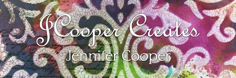
Yesterday, with a freshly cleaned work space, I decided to play with my BRAND NEW “Pretty Pink Posh” layering stencils. This was actually my first time playing with actual layering stencils. I use the Tim Holts Stampers Anonymous Layering stencils all the time, but his are called layering stencils because when you use them, you are adding a “layer” to your make. He was “layering” before there was a “layering”. So these new stencils are Brand new, but an altogether new experience as well.

I saw an inspiration video of this brand on the Simon Says Stamp website. Pretty Pink Posh is a new brand to me, but I must confess I did order quite a bit to make the cards in the video. I can only assume I was not the only one since a few of the items were out of stock. However, I did find that they (PPP) will sell direct to individuals, so I purchased the few items that I wasn’t able to get from them.

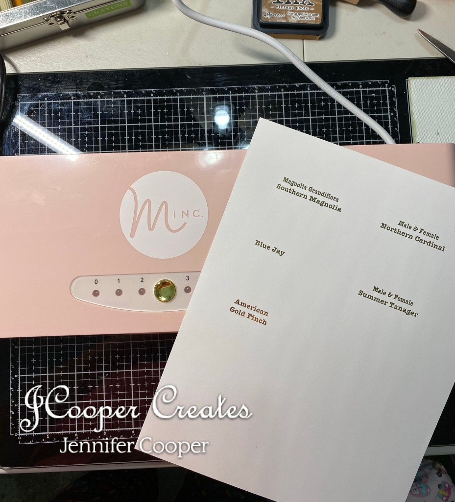
No, I can’t say that I took the time to make all the wonderful cards that they showed in the video, but I did carve out some time to make the backgrounds with the stencil sets. I took the time to cut my DistressWhite Heavystock into usable sections for card making (4-1/4″ x 5-1/2″) and picked out my preferred colors of Distress Ink.

The stencil sets that I worked with were Layered Watermelon, Layered Strawberries, and Layered Citrus. I decided that I would make several so that I have them available whenever I need them. I made ten of each, except for the watermelon set. I made 20 of those because the first set I made was too pink for the card shown in the video, but they will be cute for some other card I decide to make so they will be going in the stash. The stencils are so easy to use and they are so cute when you get finished. I did use a BRAND NEW Brutus Monroe “Stick & Stamp Mat” that I saw on the video as well. This also came from Simon Says Stamp. It’s a great new tool that I’m sure I’ll get a lot of use out of.

The first set of Watermelons Were done with Mowed Lawn, Worn Lipstick, and Black Soot.

The Citrus ones were done with Mustard Seed and Squeezed lemonade and Mustard Seed again.

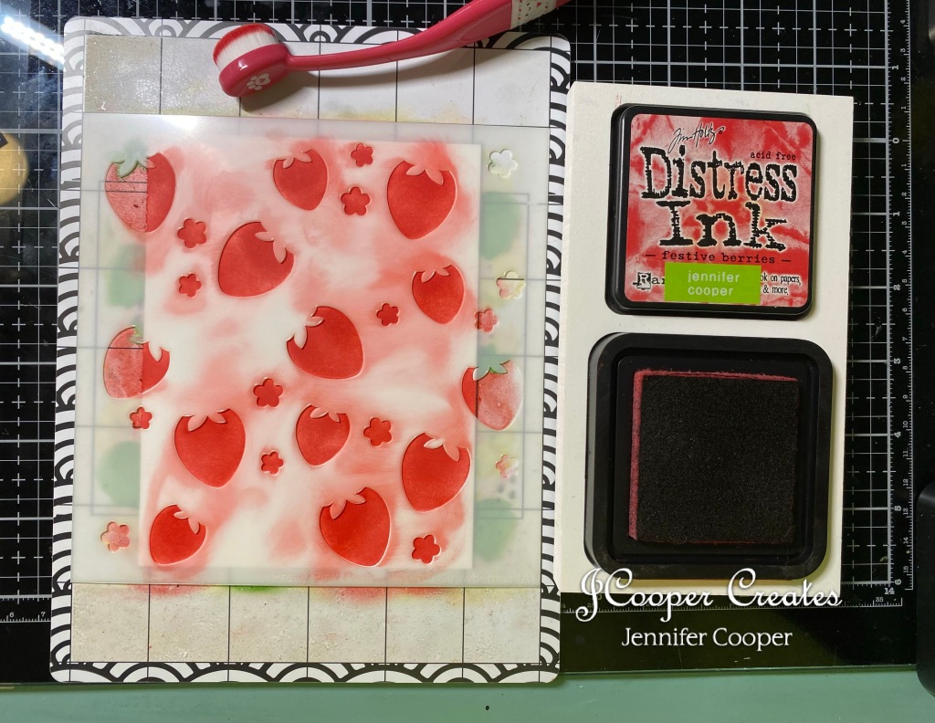
The Strawberries were done with Festive Berries, Mowed Lawn, Black Soot and Rustic Wilderness.

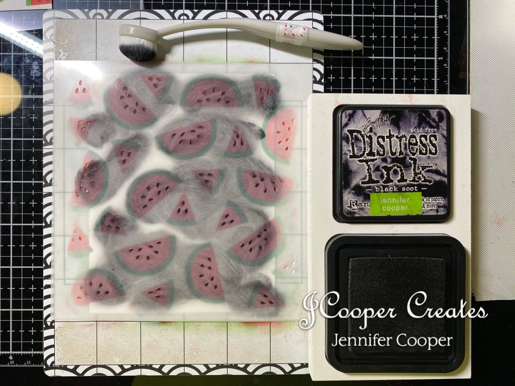
The second set of Watermelons was done with Mowed Lawn, Festive Berries and Black Soot.

As shown above in the picture galleries, I chose colors that I thought best for each stencil step, but with the Tim Holtz Distress line there are several to chose from. I lined the paper piece up on the wonderful lines on the stick & stamp mat (The best way to describe this mat is to tell you it’s a Cricut mat but only smaller and the perfect size for card makers), then I used my color coordinated blending brush to apply the ink over the stencil. Each step is lettered A, B, C, etc. So it’s really easy to do and they look so cute when you’re done. I can’t wait to start making those cards!!

I did actually get a little lost on the time yesterday. I neglected a few things like laundry, vacuuming, etc. But guess what! Make some time for what you enjoy!! The rest will definitely be there tomorrow!

Until next time,

Jennifer

Merry Christmas to All

Y’all! I’ve loaded my booth at the Grove Shreveport with lots of new Fall items. I’ve had fun making chipboard scrapbooks, handmade greeting cards, Pumpkin Spice Tins, and several bookmarks. As much as I am ready for Fall to get here, it’s time to move on to some Christmas makes. This weeks Tim Holtz Addicts challenge was to use one of the previous Stamptember sets. Stamptember is a birthday celebration at Simon Says Stamp. If you don’t know about Simon Says Stamp, then you should check them out. All the good things!! September is the month that they do what is called Stamptember. For the whole month of September, they collaborate with tons of designers to make one of a kind, limited edition stamp sets. Tim Holtz being one of them. I’ve only know about Stamptember for a few years now, so I only have two sets. Soon to be three. LOL.

So, for this weeks challenge I went with making a large tag. The stamp set that I used today is Stamptember 2021. This set came with an additional moon mask to add to the Stampers Anonymous moon mask collection. It was a great addition to my stamp collection. I am a sucker for Christmas supplies!! I think Christmas is my favorite! Let’s get into the process.

First things first, the moon. For this part of the make, I used my large spray box and put down a few paper towels. I placed the tag in the box and then put down the moon mask. I sprayed the tag with Distress Spray Stain in Prize Ribbon. I then carefully removed the mask and misted the tag with my spray bottle to make the ink wick. I am relatively new to this process, but I think it’s getting better. LOL . I dried the tag really well before taking my Distress Oxide Ink in Antique Linen and coloring in the surface of the moon. Next I took Distress Oxide Ink in Old Paper and used a finger dabber to color in the details of the moon. I think that these two colors made for a perfect moon.

Next comes the stamped details of the tag. For these, I decided to color with my Copic markers. I’m trying to get in as much practice with these as I can. It’s definitely a work in progress. Ha. I’m getting better believe it or not. For stamping the images, I used Memento in Tuxedo Black. This is a good ink to use when you are coloring with alcohol markers. For the cloud, I used B93, N2, and N4. For the trees, I used BG0000, YG97, and YG99. For Santa and his sleigh, I used E43, E44, R37, R46, Y28, YG95, BG0000, and 100. I did have to fussy cut the items before I glued them down.

For the sentiment on this tag, I decided to emboss it so that it would stand out more. I used Tim Holtz Distress Embossing Ink and for the powder, I used Lindy’s Stamp Gang “Midnight Pewter Obsidian”. For those that have never embossed before, it’s a relatively easy process. You stamp your image with the embossing ink. Then you place your item to be embossed over a piece of paper. This will help in saving the excess powder. Generously poor the powder over the stamped image and pour excess onto the piece of paper. Set the item aside and use the paper as a makeshift funnel to pour the excess back into the jar of powder. After you have gotten the excess out of the way, use your heat embossing tool to heat the powder. With this powder, I knew it was done when it was shiny. Not all powders end up shiny. Once I was done with the sentiment, I had to fussy cut the stamped details out. Once I was done with the cutting, I glued the images to my tag. For my glue, I used Distress Collage Medium and a sponge brush.

Last step in this make was to make it snow! For that, I used the Distress Snowfall Grit Paste. This was a limited edition, seasonal product by Ranger Ink from last year. The stencil I used is a layering stencil from Stampers Anonymous called Speckles (THS0210). I ran the grit paste over the stencil with a plastic spatula and then spread more of it at the bottom of the tag to give the look of a blanket of snow. You can’t tell from the pic, but the grit paste has a hint of shimmer in it. Very pretty.

The tag is drying as we speak. I think when it is dry, I’ll add some ribbon to dress it up a little bit, but other than that, I think it’s pretty cute. Let me know what you think.

I hope this little tutorial was helpful in some way. If it was, please feel free to like and follow me for more crafty makes in the not so distant future.

Until next time,

Jennifer

Products from Stampers Anonymous

I’m a Tim Holtz Addict!

Ok, so of course most of my tutorials include tons of products from Tim Holtz. For those of you that don’t know, he is a designer in the crafting world. If you know, you definitely know. There is a whole FaceBook group called “Tim Holtz Addicts” with over 3000 members, and yes, I am one. LOL. Anywho, I think the reason I am drawn to his products is that he is a junker like me. Actually, he’s a pretty hard core junker. LOL. Most of his products are geared towards creating vintage things, or making new look vintage. Take this card for instance, it started out as a blank piece of white paper, but it looks like it could have come out of your Grandma’s desk drawer. With the right tools, it looks like a vintage greeting card. Zoe, the groups creator, has started issuing weekly challenges. This weeks challenge is “Stamp & Stencil week”. I decided to take part in the fun and make this handmade greeting card. Let’s get into the process.

First is the inking process. It’s really simple. People have started calling this the “smooshie” process. That’s literally what it is. You take your desired colors and smoosh them on the nonstick mat part of your glass media mat. Then you spritz it with a little water and them dab your paper into the ink mix until you’re happy with the coverage. You dry your paper in between each application. That is what gives it that layered look. If you’re a follower, then you know I use this process quite a lot. The colors I chose for this card’s background were Distress Oxide Tea Dye, Distress Oxide Antique Linen, and Distress Oxide Speckled Egg. I used the same smoothie process with each color, making sure to dry between each application. If you don’t dry between the applications, you could end up with mud. Not pretty in my opinion.

Once my background was good and dry, I used Distress Oxide Vintage Photo to distress the edges. Distressing the edges gives it that nice, vintagey look. (It’s a word, I just made it up. Ha.)

Next, STAMPING! I used a brand new set of stamps from Stampers Anonymous. They were designed by Tim Holtz and released in his Halloween release just a few weeks ago. I bought this set for these flowers. The set is called Exquisite (CMS453). I stamped the font stamp with the Distress Ink Tea Dye, and then I stamped the flowers with the distress Archival Ink in Vintage Photo. Distress inks react with water. Archival inks do not. I was planning to watercolor these flowers so I wanted an ink that would not run when water was introduced to it.

To color my stamp, I used my Distress Crayons and a water brush to give it that watercolor effect. The color I used for the roses was Festive Berries and the color for the leaves was Rustic Wilderness. Process was simple. I scribbled some of the crayon onto my glass mat and used my water brush to pick up the color. Then I colored like it was a marker.

The last step for the background was a little bit of stencil work. I used the Stampers Anonymous layering stencil designed by, you guessed it, Tim Holtz. The stencil number is THS158. I used Distress Oxide in Speckled Egg with my Simon Says Stamp blending brush. I used a little bit of painters tape to hold the stencil in place while I ran the brush over the stencil. This is a relatively new stencil. It gives me that Midcentury vibe, but it kinda gives the hint of a trellis for the flowers. Last but not least, I added a sentiment. I used another piece of white paper and did the smooshie technique again. For the sentiment, I used a set from Sweet and Sassy Stamps. It’s designed by Korin Sutherland and the name of the set is Timeless Hymns (SNS-18-018).

Again, the challenge this week was “Stamp & Stencil”. I think the requirements were met. LOL I am in LOVE with this new stamp set. I’m a sucker for flowers and who doesn’t love coloring??

Well, I hope that this little tutorial was helpful in some way. It doesn’t have to be Tim Holtz stamps or stencils. You could use whatever you have in your stash. The inks however, his inks are the only ones I’ve found that can give you that GREAT VINTAGe look. Amazing inks!

Until next time,

Jennifer

Vintage Tins Louisiana Style

Good Morning, Y’all! I’ve been doing a little more vintage tin play this morning. A while back, I mentioned that we bought a new house. Next month will be two years that we have owned this house so it’s not really new, but pretty new to us. A little background history, our house is an Atomic Ranch built in ’56 on a bayou. The Bayou is off Cross Lake in Shreveport, LA. To be clear, Louisiana has Bayous all over the state, so you don’t have to be a Cajun to live on the Bayou. Shreveport is pretty much in the top corner of Louisiana, right on the Texas line. That’s about as far from Cajun as you can get. However, that being said, I’m still on the Bayou.

Since we’ve moved to the Bayou, I have started collecting all things Louisiana to decorate my Kitchen. That being said, I had one of these Cayenne tins in a box of tins that I purchased off of Ebay. You may have seen the Pumpkin Spice tins that I did a little bit ago. I also had the little, ceramic alligator that I picked up at an estate sale around here. Just sitting in the sewing machine drawer was a little boring so I spiced him up a little. Yes, pun intended. I posted it on my Facebook page when I was done and I got a few messages about it, so i decided to hunt down a few more tins and alligators and add them to my Etsy store. Here are the links if you’re at all interested. I had to separate them as two facing right and two facing left. Just tap the “two facing right” and “two facing left”.

Let’s talk about the process. It was so simple but they turned out so cute. So truthfully your price only reflects the hunting down of the tins and the alligators and what you’re willing to pay. You could do this with just about anything. If you see my previous blog, you will see that I did it with pumpkin spice and made them look like fall decorations. You just need to find whatever tin makes you happy or suits your purpose. I sold the pumpkin spice ones to local people before they were even on etsy for one day. I had to cancel the item. I had one special follower who found a tin in her pantry that she was keeping because she bought it in the store her mother worked in. She had a special request that I make the diorama on that special tin. Of course, I said yes!

These are the tins that I tracked down on Ebay. They are vintage tins and they are getting hard to find. Some of the tins can get really pricy so you have to do a little bit of searching to find ones that you’re willing to buy. For some reason, the pumpkin spice tins in these colors are listed for over $100. No, I don’t have any of those. LOL.

The process is really simple. The list of supplies is really short. All you need is a tin, whatever decoration you want to use, some glue, and in my case, a bag of fake moss. The glue I used is Beacons 3in1. I’m sure you could use whatever but that’s just one of the glues I had available to me.

First thing I did was squeeze a little pool of the 3in1 in the top of the tin. Then I pressed some of the fake moss until it covered the top of the tin. Believe me, that is a sticky process, so you may want to wear gloves. I did not, but it cleaned right off with soap and water. Once the moss had a few minutes to dry, I glued the little alligators on top of the moss. I did hold them down for a few minutes to make sure that they were stuck down really well. And that was it!

I just think these are super cute. Of course I may be a little biased. LOL. It’s way cuter for the alligator to have the tin rather than just that old boring alligator on a shelf. What do you think? Mine is sitting in my kitchen of course. I’m toying with some ideas for Christmas. All the spices off the holidays: Cinnamon, nutmeg, mint, cloves. So many possibilities.

Well, until next time! Thanks for joining me!

Jennifer

Pumpkin Spice and all things Nice!

Y’all! I am soooo ready for Fall! At least the Fall temperatures! Lol. It’s still pretty hot and humid here in Louisiana, but here in the craft studio, we are feeling the Fall vibes. Lol. I started last week working on some Fall ideas for The Grove in Shreveport and the Etsy revamp. I don’t know about y’all but I have tons of products and things purchased for those projects that you’re just going to get to eventually. Well, the time has come. Todays make is these cute little tins. I’m almost hoping they don’t sell so that I can keep them here. Haha. Let me walk you through a quick tutorial in case you want to do some for your house.

I got the inspiration for this cute idea from something I saw on Etsy. I purchased these cute little tins on Ebay. Beware, they can get pretty pricy so you have to put a watch on them. These McCormick tins were actually in great condition. I actually had to dump the spice out of them. They were a little bit too clean for me so I took my little sanding tool and roughed them up a bit. Then I took my Tim Holtz Vintage Photo Archival and dirtied them up a little. The Schilling tin was already a little dinged up so i just inked it a little.

I dug out my bottle brush trees to see what I had in my stash. I already had some that were painted green from last Christmas, so I painted some black and orange and brown, and purple and lime for just in case. I took the black one and decorated it with the new Tim Holtz Confections Candy Corn. I think it turned out pretty cute.

Once the trees were good and dry I started assembling the little decorations. I used 3-in-1 glue to attach everything. I did have to cut out the larger trees just a bit to make the smaller trees fit snug on the tin. For the Fall one, I added a tiny hay bale and pumpkin that I found at Hobby Lobby. (40 off, y’all!! Love it!) And of course to finish it off, I added some really cute black and orange plaid ribbon that I found at Michaels. So one of each of these will be going to The Grove in Shreveport and the other one of each will be going on Etsy. If you’d like to check out my etsy store, there is a link here on the website, but if you want to check out the tins, just click on the picture.

I think that these little tins turned out super cute. They were really simple to put together. Tim Holtz Ideology helped out a lot with bottle brushes and candy corns, and of course his Distress Spray Stains. And again, the few things that I picked up on sale at Hobby Lobby. I just love them. I hope you do too.

Until next time,.

Jennifer

Revamping my Etsy store.

Hey Y’all!! I know, I know. It’s been forever. A whole year in fact. Two days from now will mark the one year anniversary since my Daddy moved in with us. It has been a little hectic getting him settled and into a routine. Unfortunately, this has left me neglecting the craft studio. Priorities, you know.

However, lately i have realized that I have missed my happy place and therefore, I need to make more time for me and my sanity, LOL. I have found an outlet, I think. A friend and her partner have opened a local business called The Grove in Shreveport . It is a great little space where about 35 (as of now and still going) vendors can showcase their trade, or craft. I have rented a little space to try and move some of these things that I have created. Some, not so much because I just can’t part with them LOL. I signed a six month contract, so we shall see how it goes.

I have cleaned out my Etsy store and taken everything to The Grove in Shreveport. I am currently working on revamping my Etsy store and adding new items as I create them. So bare with me as I probably add in spurts,.LOL

My newest creation is a little 6″x6″ chipboard book. A friend on Facebook suggested I needed something Tiger themed. I mean I do live in Louisiana after all. It is not LSU specific, because that gets sticky, but it is purple and gold, y’all. I do not have any procedure pics since I was just making these for The Grove in Shreveport and for Etsy. I have two for them and two for Etsy.

Geaux Tigers Chipboard Book on Etsy

Here is the link to the item on Etsy if you would like to check it out.

Geaux Tigers

Until next time,

Jennifer

“Fall Breeze, Autumn Leaves, Coffee Please”

I know, I know. It ‘s still smack dab in the middle of Summer. Here in Louisiana, we are dealing with heat index warnings and temperatures of “feels like” 105-108. Not to mention the humidity. So, yes, I’m dreaming of a little Fall weather. Plus. I got some new “Sweet’nSassy” stamps in and decided to play with these first. I’ve been seeing some really cute cards on Instagram made with these stamps and decided I needed them. Haha. Here’s a quick “how to” of what and how I used for this card.

First things first, the background. The gingham paper was stamped with the new “Background Builders Stripes Stamp Set”. I simply love gingham and I LOVE this set because I can make whatever color I want, AND I can make a gingham in every Tim Holtz colr that I need. Haha. For this card I chose the Distress Archival Vintage Photo. I stamped the lines horizontal and then turned the paper vertical to get the lovely gingham pattern. The second layer of the background was stamped with the new “Fall Background Stamp”. For this piece I chose the Wendy Vecchi Archival Orange Blossom. I feel like both of these colors are great Fall colors. Of course I distressed each piece with my Distress Ink in Vintage Photo.

Next was the sentiment and the little bits and pieces to add to the card. For these, I used the new set “Fall Breeze”.I stamped them with my Distress Archival Vintage Photo. I colored the images with my Copic markers. I’m not a pro at coloring with the Copics. I’m still learning. It just takes lots of practice. I chose colors that I thought would be good Fall colors. You can chose whatever you like. My choices are shown in the above picture. Once everything was colored, I used the matching “Fall Breeze” die set and cut them out with my Sizzix Sidekick. This little sidekick is very handy for quick jobs.

Last, but not least was the assembly. I wrapped the sentiment with some twine and pop dotted it onto the background and then added a bow of twine on top of that. Then, I assembled the pieces the way I thought looked best at the bottom. I decided that I didn’t like how stark white the edges of the pieces were, so I distressed them with Vinage Photo as well and pop dotted them to the card.

And that as they say is that. This card was really simple and easy to make. I had fun with these new stamps. I think the card turned out very “Fall-y’. I think I feel a change in the air already. NOT! Hey, a girl can dream.

Until next time,

Jennifer

Hello My Friend

Hello, my friends! I was so excited to receive my new stamp sets from the Tim Holt Stampers Anonymous collection. These stamps were just released a few weeks ago. I was only able to order just a few this time but there’s always later. LOL. I used both of the sets I bought in this make. I think my favorite of these was the set “Bold Sayings” (CMS433). They just scream that they need a WILD background. I’m not real sure, but I may have over done it on the back ground, but I think it’s growing on me the more I look at it. LOL. I do admit I think I threw a little bit of everything inky into this one.

I’m feeling a little blah today, with allergies and sinuses, so I wanted to go bright and cheery with this one. The colors I chose were Distress Oxide Picked Raspberry, Dusty Concord, Mermaid Lagoon, Ripe Persimmon, Mustard Seed, and Mowed Lawn. I smudged a little of each individual ink pad onto the nonstick portion of my glass mat. I spritzed it with a little bit of water, and dabbed the paper into each color until I was happy with the coverage. The paper that I used today was Distress Heavystock in white. I think the bold colors really popped on the white. There were a few white spots left, but not too many. To take care of those, I used Squeezed Lemonade and a blending tool. I know I use this technique alot, but I just LOVE the way it turns out.

Next, I took my Distress sprayer bottle, squirted a little water into my hand, and flung it onto the card. Fling, sling, hopefully you get the idea. LOL. Then you dab the water off with a paper towel or rag, whatever you have handy. The next step was to add a little layering stencil. The stencil I chose was THS083. I used the latest addition to the Distress color line, Salvaged Patina and a blending brush. I have to tell you that I don’t think this step really shows up, now that it’s all said and done, but it’s in there. I promise.

Once the inky layers were done, came the stamping part of the background process. I felt like those colors were almost neon on that white paper, so I figured I wouldn’t go wrong with a little grunge so I used the Stampers Anonymous set “Ultimate Grunge” (CMS075). It’s an older set, obviously by the number, but it is definitely well used. The colors I chose for this stamp set were Distress Archival colors Mermaid Lagoon and Spiced Marmalade. Then I got brave, I think, and used the brand new set “Floral Outlines” (CMS430) on the background as well. To stamp these images, I used the brand new Distress Archival Hickory Smoke. Not a brand new color, but brand new FULL SIZE. So excited about the full size pads. As you can see from the Mermaid Lagoon and Spiced Marmalade in the above pic, the larger ink pad is much easier to work with than the minis. And I don’t think I would consider a background complete without a little Vintage Photo distressed edges. LOL.

Last step but definitely not the least step is the sentiment. For the sentiment on this card, I used the Brand New set “Bold Sayings” (CMS433). I went with embossing it instead of just stamping because I wanted it to stand out more. I think I can consider that mission accomplished. It really pops on this bright and bold background. For the embossing I used Ranger Black embossing powder, Distress Embossing Ink, and my Heidi Swapp embossing tool. For those that don’t know, embossing is a really easy technique. First, you stamp your image with the embossing ink. Then you place your stamped image over a piece of paper, or a coffee filter to catch the excess. You then sprinkle the embossing powder very liberally over stamped image. Then you tip the paper so that the excess falls onto the piece of paper. You will then pour the excess back into the jar of powder. After you’re sure that your image is well covered with the powder, you take the embossing tool and heat the powder. Depending on the type of powder you used, you will know it’s done, when it turns shiny in this case. Some embossing powders have a dull finish or metallic. Like I said, it just depends on the type and the brand.

Well, I hope this quick tutorial was helpful in some way. The jury is still out on whether I like it or not. LOL. It may be a little too busyfor me. I think that’s normal with any crafter. We are always our worst critic. LOL. I was going for Bold and Bright and it is definitely that. What do you think? Let me know!

Until next time,

Jennifer

Red, White and Blue

This weeks prompt for the Simon Says Stamp Monday Challenge is Red, White and/or Blue so I decided to go a little patriotic since July the 4th is right aroung the corner. For this weeks challenge, I used a Dina Wakley #8 white media tag. You can purchase these in bulk on the Ranger Ink website. If you make a lot of tags, this is a great way to stock up. This tag was a quick little project and very easy to make. Let’s get started.

The background was really quick and easy. I used Distress Oxides in Fired Brick and Chipped Sapphire for my colors. I just smudged the ink on my nonstick mat and spritzed it with a little water. I then dabbed my tag into the ink until I was happy with the coverage. And no background would be complete without a little Vintage Photo for distressing the edges.

I wanted to add some stars, of course, so to make them stand out I used Distress Grit Paste. It also gave the stars a little texture and dimension. Unlike texture paste, that would have absorded the ink colors, Grit paste stays white.

Next up, a little stamping and coloring. The stamp sets that I chose to use today were “Americana” (THMB006) from Stampers Anonymous and “Friendship is a Blessing” from Sweet ‘n Sassy Stamps. I love Stampers Anonymous for most of my image stamps because, yes, they were designed by Tim Holtz who does a wonderful job of designing vintagey stamps. I am simply in LOVE with this Sweet ‘n Sassy sentiment. I think todays sentiment is a perfect reminder.

All of the images were stamped with “Tuxedo Black” Memento Ink on another white tag. I choose to use Memento when I am coloring with my Copic markers. It doesn’t bleed with the alcohol ink from the markers. I have pictured the colors that I used with each image, but you can use whatever color you choose to. I’m including an image of a chart that I dowloaded from Pintereset a LONG time ago. You can tell because the colors on the chart are not complete. I believe it is just someones homemade project and is in no way made by me. There may be a more up to date chart available but I’m not sure. I may need to check into that. LOL.

Once the stamping and coloring was complete, I trimmed the pieces down, distressed them with my Vintage Photo, and pieced the make together with my Distress Collage Medium. And I added a few pop dots to the sentiment. A little bakers twine on the remaining part of the tag, and finished.

I by no means want to turn this blog into a political platform, but I do feel that whatever you believe about the leadership of this country, we need to be praying, DAILY, for the President, his advisors, and for this great USA. I hope you all have a wonderful Independence Day.

Until next time,

Jennifer

Distractions with Nature and Birding

As most of you know, we moved into our new home on the bayou back in February. Since we’ve been here, I’ve seen more birds than I’ve ever seen at any of our previous homes. Most are pretty common, but I have seen a few that I’ve never seen before and a few that are pretty rare. I’ve really enjoyed taking pictures of these birds and sort of documenting them, so I decided to join my new love for “birding” and my long time love of crafting together for this one project. Hopefully it will be ongoing and have sever entries. For this project, I decided to do an art jounal. I started with the Blue Jay. You may say, he’s pretty common. Well maybe, but my Blue Jay is not very sociable so he doesn’t make it to the feeder very often, and when he does, he’s usually gone before I can get back with my camera. LOL.

When I got this idea, I got really excited and cut out several birds. I’m hoping that my enthusiasm carries on and I have to make more. LOL. For these birds, I used the Cardinal die from last years Diecember from http://www.simonsaysstamp.com. It was a free gift with purchase of any Tim Holtz product. and of course, I made a purchase. LOL. I also used the Feathered Friends (664433) set. The paper that I used was just plain old water color paper. I took an afternoon and had my self another Vagabond party and cut out several of each set and glued them together. I also flipped the paper over and cut them out backwards so that they could face the other way.

The next day, I decided that all those birds needed some branches, and of course the branches needed some leaves. I used a few differents Distress Oxide Sprays in several shades of browns and greens. Then I used Stampers Anonymous Birch & Pine (CMS280) and Papillon (CMS106) stamp sets to give them a little dimension and texture. Then I had another little Vagabond party. I used the Sizzix Bigz die Bird Branch (657833), an obvious choice LOL, and Garden Greens (661206) thinlits set to cut out the leaves.

Now of course all of this is being done while I waited on a stamp set to come in. LOL. I decide to decorate the cover of my journal. For this art journal, I chose the Dylusions Creative Flip Journal. It’s perfect size for what I had in mind. I decided to use the Tim Holtz idea-ology collage paper and my Distress Collage Medium. The name of this particular design on this paper is Aviary. It has tons of beautiful, vintage birds and scripty things. Beautiful!! Just the paper wasn’t enough, so I decided to add a flower just in case I wanted to include flowers in my nature art journal. The die set that I used was Sizzix Brushstroke Flowers #1. Naturally, being from Louisiana and documenting LA nature, I went with a Magnolia. I used my Distress Crayons to color it. The tag was made with just regular cardstock, but printed on my toner printer and run through my Heidi Swapp Minc. And of course every thing needs a little Vintage Photo to give it that distressed vintage look. LOL

Unfortunately, I neglected to take any pics of the coloring process of the bird. But I can tell you I used my Distress Crayons, if that helps any. For the page background, I used Distress Oxides in Speckled Egg, Salvaged Patina, and Tumbled Glass and then distressed the edges with Vintage Photo. I then used the stamp set Field Notes (CMS396) and Wendy Vecchi Archival ink in Cornflower Blue to add another layer. I just love crackle paste, so I used that and the mini layering stencil THMS031. I layed it sideways and it filled the bottom of the page just perfectly. Once that dried, I glued everything on the page with my Distress Collage Medium.

I think I’m pleased with the way this turned out and I think this is going to be a fun ongoing project. I already know which bird I’m doing next. I just can’t wait to see what other birds are gonna show up in my yard!! I hope y’all enjoy this little series as much as I think I’m going to. LOL

Until next time,

Jennife